Background

The Product

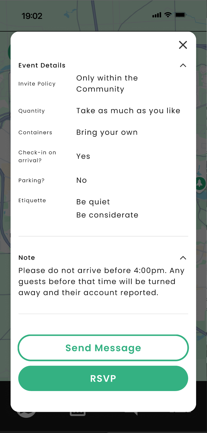
Scavenge is an app concept designed for a design systems course at UMSI in March and April of 2025. The idea came from a friend of mine who has a background in sustainable food systems: An app that lets people find leftover food from events.

For example, UMSI might host an event with food for prospective students. Once the event is over, UMSI can post to Scavenge with details, directions, and instructions for Scavengers to come get the leftovers.

The hope is that this would reduce food waste while also of course benefitting Scavengers who might find themselves a free meal.

The Project (i.e., caveats)

As mentioned, this was done for a design systems course. As such, the business model for the app, comprehensiveness of the prototype, branding and identity, and other details that would be important for developing a new product, weren't emphasized.

I want to present this piece as more of a demonstration of design system skills rather than a grand presentation of a new app. With that said, naturally I want the UI and UX of any prototype I make to look and feel good.

If you want to skip the written stuff and go right to the prototype, please do so!

A Walk Through the App

The app has two user-types: Hosts, and scavengers. Hosts create posts for events that have food, and Scavengers RSVP to posts and pick up food from them.

For the purposes of the project for the class, the prototype focuses on the Scavenger view.

That's the main flow. There's the host side of the app in making and posting events, but there's also a social aspect of the app in adding friends and joining Communities.

The Design System

Type Style

The type style is the same used for this presentation, naturally:

Poppins
Sg
ABCDEFGHIJKLMNOPQRSTUVWXYZabcdefghijklmnopqrstuvwxyz
0123456789 !@#$%^&*()
Bree Serif
Sg
ABCDEFGHIJKLMNOPQRSTUVWXYZ
abcdefghijklmnopqrstuvwxyz
0123456789 !@#$%^&*()

Type Size & Spacing

For headings, I settled on a 1.1875 (i.e. 1-3/16ths) after first trying out 1.25. The latter felt too large for mobile, so I made the switch. As an example of what this looks like:

In the exact same way, the design system includes standard sizes for paragraphs (p1-p6), labels, and buttons.

Similarly, there are also standard line heights of 1.3x the line height for headings and 1.5x for everything else.

Color

Color's my favorite part of all this. It's bright, it's fun, and you'll always end up having to tinker with it. Oh, and it's especially satisfying changing a color variable and seeing the change cascade through the prototype like magic.

I've seen different numbering conventions for design systems. I like basing it around 0-100 where the number indicates the brightness. Any number higher than 100 subtracts from the saturation. For example, if a color starts with 70 saturation, 130 would have a brightness of 100 and saturation of 40 (70 - 30 = 40).

This gives a clean effect of progressing from darker to lighter through the color scale.

Dark Mode

Part of the project was building in a dark mode alongside the default light mode. This is easy enough using Modes in Figma, with a bit of tweaking to make sure the dark mode colors look good.

Components

Of course the components starts with the buttons.

Some examples of other components in the design system:

The Prototype

See It For Yourself

Of course, here's another link to the Figma prototype, where you can see all the screens for light & dark modes, the components, and the variables.

home
Home